Thursday, May 7, 2020

Candlestick pattern


                                Candlestick pattern

From Wikipedia, the free encyclopedia
Jump to navigation Jump to search
In technical analysis, a candlestick pattern is a movement in prices shown graphically on a candlestick chart that some believe can predict a particular market movement. The recognition of the pattern is subjective and programs that are used for charting have to rely on predefined rules to match the pattern. There are 42 recognised patterns that can be split into simple and complex patterns.

History

Some of the earliest technical trading analysis was used to track prices of rice in the 18th century. Much of the credit for candlestick charting goes to Munehisa Homma (1724–1803), a rice merchant from Sakata, Japan who traded in the Ojima Rice market in Osaka during the Tokugawa Shogunate. According to Steve Nison, however, candlestick charting came later, probably beginning after 1850.[1]

Formation of candlestick

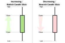
The aspects of a candlestick pattern
Candlesticks are graphical representations of price movements for a given period of time. They are commonly formed by the opening, high, low, and closing prices of a financial instrument.
If the opening price is above the closing price then a filled (normally red or black) candlestick is drawn.
If the closing price is above the opening price, then normally a green or a hollow candlestick (white with black outline) is shown.
The filled or hollow portion of the candle is known as the body or real body, and can be long, normal, or short depending on its proportion to the lines above or below it.
The lines above and below, known as shadows, tails, or wicks represent the high and low price ranges within a specified time period. However, not all candlesticks have shadows.

Simple patterns


Big-black-candle.svg
Big Black Candle Has an unusually long black body with a wide range between high and low. Prices open near the high and close near the low. Considered a bearish pattern.
Big-white-candle.svg
Big White Candle Has an unusually long white body with a wide range between high and low of the day. Prices open near the low and close near the high. Considered a bullish pattern.
 

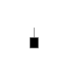
Black-body.svg
Black Body Formed when the opening price is higher than the closing price. Considered to be a bearish signal.
White-body.svg
White Body Formed when the closing price is higher than the opening price and considered a bullish signal.
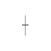
Doji.svg
Doji Formed when opening and closing prices are virtually the same. The lengths of shadows can vary.
Long-legged-doji.svg
Long-Legged Doji Consists of a Doji with very long upper and lower shadows. Indicates strong forces balanced in opposition.


Dragonfly-doji.svg
Dragonfly Doji Formed when the opening and the closing prices are at the highest of the day. If it has a longer lower shadow it signals a more bullish trend. When appearing at market bottoms it is considered to be a reversal signal.
Gravestone-doji.svg
Gravestone Doji Formed when the opening and closing prices are at the lowest of the day. If it has a longer upper shadow it signals a bearish trend. When it appears at market top it is considered a reversal signal.


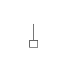
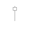
Hammer-candlestick.svg
Hammer A black or a white candlestick that consists of a small body near the high with a little or no upper shadow and a long lower tail. Considered a bullish pattern during a downtrend.
Hanging-man.svg
Hanging Man A black or a white candlestick that consists of a small body near the high with a little or no upper shadow and a long lower tail. The lower tail should be two or three times the height of the body. Considered a bearish pattern during an uptrend.


Inverted-hammer.svg
Inverted Hammer A black or a white candlestick in an upside-down hammer position.
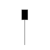
Shooting-star.svg
Shooting Star A black or a white candlestick that has a small body, a long upper shadow and a little or no lower tail. Considered a bearish pattern in an uptrend.


Long-upper-shadow.svg
Long Upper Shadow A black or a white candlestick with an upper shadow that has a length of 2/3 or more of the total range of the candlestick. Normally considered a bearish signal when it appears around price resistance levels.
Long-lower-shadow.svg
Long Lower Shadow A black or a white candlestick is formed with a lower tail that has a length of 2/3 or more of the total range of the candlestick. Normally considered a bullish signal when it appears around price support levels.


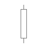
Marubozu.svg
Marubozu A long or a normal candlestick (black or white) with no shadow or tail. The high and the lows represent the opening and the closing prices. Considered a continuation pattern.
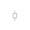
Spinning-top.svg
Spinning Top A black or a white candlestick with a small body. The size of shadows can vary. Interpreted as a neutral pattern but gains importance when it is part of other formations.


Shaven-head.svg
Shaven Head A black or a white candlestick with no upper shadow. [Compared with hammer.]
Shaven-bottom.svg
Shaven Bottom A black or a white candlestick with no lower tail. [Compare with Inverted Hammer.]

Complex patterns


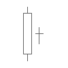
Bearish-harami.svg
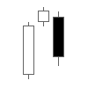
Bearish Harami Consists of an unusually large white body followed by a small black body (contained within large white body). It is considered as a bearish pattern when preceded by an uptrend.
Bearish-harami-cross.svg
Bearish Harami Cross A large white body followed by a Doji. Considered as a reversal signal when it appears at the top.
 

Bearish-3-method-formation.svg
Bearish 3-Method Formation A long black body followed by three small bodies (normally white) and a long black body. The three white bodies are contained within the range of first black body. This is considered as a bearish continuation pattern.
Bullish-3-method-formation.svg
Bullish 3-Method Formation Consists of a long white body followed by three small bodies (normally black) and a long white body. The three black bodies are contained within the range of first white body. This is considered as a bullish continuation pattern.
 

Bullish-harami.svg
Bullish Harami Consists of an unusually large black body followed by a small white body (contained within large black body). It is considered as a bullish pattern when preceded by a downtrend.
Bullish-harami-cross.svg
Bullish Harami Cross A large black body followed by a Doji. It is considered as a reversal signal when it appears at the bottom.
 

Dark-cloud-cover.svg
Dark Cloud Cover Consists of a long white candlestick followed by a black candlestick that opens above the high of the white candlestick and closes well into the body of the white candlestick. It is considered as a bearish reversal signal during an uptrend.
Engulfing-bearish-line.svg
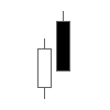
Engulfing Bearish Line Consists of a small white body that is contained within the followed large black candlestick. When it appears at top it is considered as a major reversal signal.
 

Engulfing-bullish-line.svg
Engulfing Bullish Consists of a small black body that is contained within the followed large white candlestick. When it appears at bottom it is interpreted as a major reversal signal.
Evening-doji-star.svg
Evening Doji Star Consists of three candlesticks. First is a large white body candlestick followed by a Doji that gap above the white body. The third candlestick is a black body that closes well into the white body. When it appears at the top it is considered as a reversal signal. It signals more bearish trend than the evening star pattern because of the doji that has appeared between the two bodies.
 

Evening-star.svg
Evening Star Consists of a large white body candlestick followed by a small body candlestick (black or white) that gaps above the previous. The third is a black body candlestick that closes well within the large white body. It is considered as a reversal signal when it appears at top level.
Falling-window.svg
Falling Window A window (gap) is created when the high of the second candlestick is below the low of the preceding candlestick. It is considered that the window should be filled with a probable resistance.
 

Morning-doji-star.svg
Morning Doji Star Consists of a large black body candlestick followed by a Doji that occurred below the preceding candlestick. On the following day, a third white body candlestick is formed that closed well into the black body candlestick which appeared before the Doji. It is considered as a major reversal signal that is more bullish than the regular morning star pattern because of the existence of the Doji.
Morning-star.svg
Morning Star Consists of a large black body candlestick followed by a small body (black or white) that occurred below the large black body candlestick. On the following day, a third white body candlestick is formed that closed well into the black body candlestick. It is considered as a major reversal signal when it appears at bottom.
 

On-neckline.svg
On Neckline In a downtrend, Consists of a black candlestick followed by a small body white candlestick with its close near the low of the preceding black candlestick. It is considered as a bearish pattern when the low of the white candlestick is penetrated.
Three-black-crows.svg
Three Black Crows Consists of three long black candlesticks with consecutively lower closes. The closing prices are near to or at their lows. When it appears at top it is considered as a top reversal signal.
 

Three-white-soldiers.svg
Three White Soldiers Consists of three long white candlesticks with consecutively higher closes. The closing prices are near to or at their highs. When it appears at bottom it is interpreted as a bottom reversal signal.
Tweezer-bottoms.svg
Tweezer Bottoms Consists of two or more candlesticks with matching bottoms. The candlesticks may or may not be consecutive and the sizes or the colours can vary. It is considered as a minor reversal signal that becomes more important when the candlesticks form another pattern.
 

Tweezer-tops.svg
Tweezer Tops Consists of two or more candlesticks with matching tops. The candlesticks may or may not be consecutive and the sizes or the colours can vary. It is considered as a minor reversal signal that becomes more important when the candlesticks form another pattern.
Doji-star.svg
Doji Star Consists of a black or a white candlestick followed by a Doji that gap above or below these. It is considered as a reversal signal with confirmation during the next trading day.
 

Piercing-line.svg
Piercing Line Consists of a black candlestick followed by a white candlestick that opens lower than the low of preceding but closes more than halfway into black body candlestick. It is considered as reversal signal when it appears at bottom.
Rising-window.svg
Rising Window A window (gap) is created when the low of the second candlestick is above the high of the preceding candlestick. It is considered that the window should provide support to the selling pressure.

Source :- https://en.wikipedia.org/wiki/Candlestick_pattern
Bullish and Bearish Candlesticks

            Bullish and Bearish Candlesticks


Bullish candlestick is green or white and its close is greater than its open; Bearish candlestick is red or black and close is below open
When the closing price of the candlestick is greater than the opening price, then the candle is a bullish candlestick and is represented by a white or green candlestick real body. Conversely, if the closing price is less than the opening price, then the candlestick is a bearish candlestick and is represented by a black or red candlestick real body. Throughout the finvids.com site, the words bull or bullish candlestick (shown by a green candlestick) and bear or bearish candlestick (shown by a red candlestick) will be used.

Real Body and Upper and Lower Shadows

Upper shadow is above the candle body and lower shadow is below, the candle body is the real body
The rectangular area between the opening and the close of a session of trading is called the real body. The thin lines that look like candle wicks above and below the real body are called shadows. The shadow above the real body is called the upper shadow, the top end of the upper shadow corresponding to the high of the session of trading, and the shadow below the real body is called the lower shadow, where the bottom end of the lower shadow corresponds to the low of the session of trading.

Bullish Candlestick

Intra day chart showing that an intra-day uptrend creates a 1 day bullish candlestick
When discussing trading sessions based on a trading day (morning to afternoon), generally speaking the two most significant times of the trading day are the opening and the close. The opening and the close create the real body of the candlestick; hence, the most important part of a candlestick is the real body. By looking at a candlestick, a person can quickly tell whether traders were eagerly buying throughout the day (bulls were in charge for the trading day) - the candlestick is green, or whether traders were eagerly selling throughout the day (bears dominated the trading day) - the candlestick is red. By looking at the size of the real body of the candlestick, a trader can tell if the bulls were significantly in charge of the trading day (a tall green candlestick) or only moderately in charge of the trading day (a small green candlestick). Similarly, if a trader sees a large red candle, he or she can assume that the selling pressure of the bears overpowered the bulls for the day; however, if the candlestick is very small and red, then the trader can see that the bears were only slightly more powerful that day than the bulls. In summary, the real body of a candlestick can summarize the outcome of a period of trading in an easy to see way – green = bulls win the trading session, red = bears win the trading session; and the height of the candle equals the margin of victory for the bulls or the bears.
Intra day chart showing an intra-day downtrend creates a 1 day bearish candlestick
Steve Nison (1994) states that “for a [bullish] candle to have meaning, some Japanese candlestick traders believe that the real body should be at least three times as long as the previous day’s real body.” (p. 20). Roads (2008) suggests the following: “determine the area covered by the difference between the close and the open. If it’s at least 90 percent of the area covered by the difference between the high and low, you have a long white candle” (p. 76). An example of a computer charting package’s definition is: “Its Close price is higher than the Open price; Its body is longer than each shadow; Its body is longer than the average body size calculated for the specified number of preceding candles” (ThinkorSwim, 2011).

Bullish Marubozu

Bullish marubozu has no upper or lower shadow and the real body is large
There are specific versions of the bullish candle. The first is a very bullish candlestick called the bullish marubozu. The rough translation of marubozu is “bald or little hair” (Rhoads, 2008, p. 74). A marubozu is bald or has little hair because a marubozu has no upper or lower shadow, or at least a very small upper and/or lower shadow. This is the most extreme form of the bullish candlestick because bulls were in charge from the opening to the close; bears were unable to push prices below the opening price and the trading session ended with bulls still buying pushing prices upward until the close.

Closing Bullish Marubozu

Closing Bullish Marubozu has no upper shadow and is a long bullish candle
A less bullish version, but nevertheless still bullish, is the closing bullish marubozu. With the closing marubozu, prices opened, but during the trading session, bears were able to push prices low enough to make a new low; however, bulls returned and kept buying and rising prices until the close of the day. The closing marubozu has no upper shadow because the close of the trading session is also the high of the trading session.

Opening Bullish Marubozu

Opening Bullish Marubozu has no lower shadow and a long bullish real body
The final version of the bullish marubozu is the opening bullish marubozu. The opening marubozu opens and continues higher throughout the day, never going below the opening price. Unfortunately for bulls, prices rise to a point where bears come in and are strong enough to push prices lower to the close. The fact that bears were able to possess enough power to push prices lower makes this candlestick pattern less bullish than the regular marubozu where bulls started the day in control and ended the day in control.

Bearish Marubozu

Bearish marubozu has no upper and lower shadow
In contrast, the bearish marubozu occurs when prices open and immediately there is selling, this selloff continues until the close when selling pressure from the bears makes the close the low of the trading session. The bearish marubozu should have no upper or lower shadow.

Closing Bearish Marubozu

Closing bearish marubozu has no lower shadow
The closing bearish marubozu opens, but during the trading session bulls are able to move higher past the opening price and make an upper shadow; however, bears take over and for the rest of the trading session, bears push prices downwards making the closing price the low of the trading session as well.

Opening Bearish Marubozu

Opening bearish marubozu has no upper shadow
Though still very bearish, the opening bearish marubozu is less bearish than the previous two marubozu’s because during the trading session, bulls are able to repel the bears, thus pushing the closing price higher than the low reached during the session.
Normally, one single candlestick is not enough justification to make a trade. However, there are instances when a single candlestick can provide confirmation of a support or resistance line, a trendline, a moving average, or a breakout.

Bullish Candlestick Confirming Support

Bullish candlestick bouncing off of support
In the chart above of the S&P 500 Exchange Traded Fund (ETF) the blue support line is confirmed with large bullish candlesticks. It can be inferred from these large bullish candlesticks that bulls are entirely in charge of the market at the price around the support area. An informed trader would also notice that these two strong bullish candlesticks have created a double bottom chart pattern.

Bearish Candlestick Confirming Resistance

Bearish candlestick falling off of support
The chart above of the Energy SPDR ETF (XLE) shows that whenever prices reached the area of resistance, shown with the blue line above, bears came in to sell and were able to create long bearish candles downward off of the resistance line. It can be inferred from the chart that either bulls were unable or unwilling to try to push prices higher past the resistance area or the bulls were overwhelmed by the selling pressure of the bears. Either way, the resistance line was defended and kept intact.

Bullish Candlestick Confirming Uptrend

Bullish candlestick confirming uptrend
The chart above of the Dow Jones Industrial Index ETF (DIA) shows that each time the prices reached the upward sloping trend line a large bullish candlestick was formed. Bulls were very willing to buy the Dow Jones Industrial index at this trend line and were able to keep the upward trend intact. Similarly, bears were unwilling or unable to sell into the area of the upward sloping trend line, thus keeping the upward trend unbroken.

Bearish Candlestick Confirming Downtrend

Bearish candlestick confirming downward trend
Notice in the chart above of the Silver ETF (SLV) that price movement up into the downward trend line was met by large bearish candlesticks. In fact, every large bearish candlestick off of the downward trend line set the stage for at least a week of subsequent lower prices.

Bullish Candlestick Confirming Moving Average

Bullish candlestick bouncing off of 50-day moving average
Bullish candlesticks can be used to confirm the validity of common moving average support lines. In the chart above of the Energy SPDR Index ETF (XLE), the commonly used 50-day simple moving average was confirmed multiple times by large bullish candlesticks. Every time the prices moved into the area of the upward sloping 50-day moving average, the bulls appeared pushing prices higher and initiating multi-week uptrends before returning back to the moving average to once again be defended by yet another bullish candlestick.

Bullish Candlestick Breaks Overhead Resistance

Bullish candlestick is seen piercing through overhead resistance
A large bullish candlestick rising through overhead resistance can signal resistance has finally been broken. Especially when combined with large volume, a large bullish candlestick piercing through overhead resistance can signify that a new trend upward is about to begin. A 7-month consolidation in the Gold ETF (GLD) was broken with a large bullish candlestick. Bears were unable to repel this strong showing of the bulls, and for the next few months the trend was almost completely up.

Bearish Candlestick Breaks Below Support

Bearish candlestick is seen piercing through support
The chart above of the S&P 500 ETF (SPY) shows a large bearish candlestick penetrating through the support line and closing below the support line. In fact the candlestick that broke through the support area was a closing bearish marubozu, meaning that bears pushed prices down to the very end of trading, bull were unable or unwilling to step in to buy at the support area like they did previously. This is a sign that the status quo is about to change, which was confirmed by a steep drop the next few trading days. Also notice the bull candle the following day – the bullish candlestick was unable to go above the recently broken support line. In fact, bears were now willing to sell or short to defend this historical support line which now becomes the overhead resistance line.

Bullish Candlestick Acting As New Support

Support line drawn at base of bullish candlestick
Sometimes a strong bullish move upward resulting in a large bullish candlestick can be overdone, having moved too far too fast and becoming overbought. However, there are times when this large bullish candlestick can act as support for these retreating prices. The chart above of the Gold ETF (GLD) shows two instances of the opening of the large bullish candlestick acting as price support over time. As was taught previously, a large bullish candlestick is created when prices reach a level where bulls feel confident buying and bears are either not willing or are incapable of pushing prices lower. When prices later reach that same price level, bulls feel confident once again to buy; therefore, confirming an area of support.

Bearish Candlestick Acting As New Resistance

Resistance line drawn at top of large bearish candlestick
Long bearish candlesticks are typically oversold and consequently are subject to bullish reversals. However, the opening of the large bearish candlestick can sometimes be used as a new resistance level. As can be inferred from a large bearish candlestick, the bears were confident in selling at the area of the open of the large bearish candlestick; in addition, the bulls were unable or unwilling to buy and thus the bears were able to sell without much opposition throughout the entire trading day. When prices begin to move upward over time entering into the price levels where the long bearish candlestick was formed, the same price level is finally reached where previously the bears were able to strongly sell and the bulls were unable to push prices higher. Thus, an overhead resistance is created. The chart above of the Utility SPDR (XLU) illustrates how the opening of the long bearish candlestick acted as resistance for future prices.

Sources :-  http://www.finvids.com/Candlestick-Chart/

Wednesday, May 6, 2020

3rd Day Candlestick Pattern/Engulfing Candlestick Pattern

                       Engulfing Candlestick Pattern

https://www.profitf.com/articles/forex-education/engulfing-pattern/


engulfing--pattern-
Engulfing Pattern Definition, Engulfing-Candlestick Pattern meaning. What Is “Engulfing Candlestick Pattern” in Forex? 
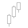
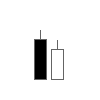
The engulfing candlestick patterns, bullish or bearish are one of the easiest of candlestick reversal patterns to identify. Because these candlestick patterns are two-candlestick patterns, they are more valid and are often looked upon as reversal patterns. As with any candlestick pattern, the bullish or bearish engulfing pattern takes more priority depending on the time frame that they are formed on. Therefore, when looking to trade with the engulfing candlestick pattern, it is essential to first scan the charts from monthly, weekly and daily and then to the lower time frames. popualr formation for Price Action Trading (  ?  What is PAT? )
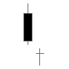
 

What are engulfing candlestick patterns?


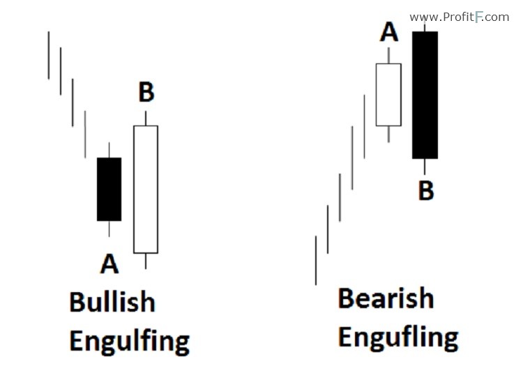
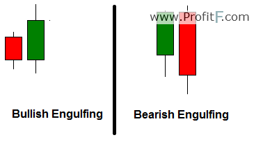
Engulfing candlestick patterns takes two candlesticks to be identified. A bullish engulfing pattern is characterized by a bullish candle whose body, the open and close engulfs the previous candle’s body. Conversely, a bearish engulfing pattern is characterized by a bearish candle whose body engulfs the previous candle’s body.
What are engulfing candlestick patterns?
Figure 1: Ideal Engulfing Patterns
For more validity, if the engulfing candle’s high and low engulfs the previous candle’s high and low, the pattern is found to be more valid. The chart below shows different examples of various bullish and bearish engulfing candlestick patterns. In the example chart below, we also point out a false or an invalid engulfing pattern. It is false due to the fact that the open and close (the body) of the second candle does not completely engulf the open/close of the previous candle.
 Bullish and Bearish Engulfing Patterns
Figure 2: Bullish and Bearish Engulfing Patterns


Why are engulfing candlestick patterns formed?


An engulfing candlestick patterns are usually identified near the tops and bottom. They exhibit extreme market sentiment. In other words, a bullish engulfing pattern tells us that the buyers have overwhelmed the sellers in the market, thus engulfing the entire previous day’s open and closing prices. Conversely, a bearish engulfing candlestick pattern tells us of the sellers overwhelming the buyers and thus indicative of a drop in prices.
Engulfing candlestick patterns can be traded as a reversal candlestick pattern when found at the tops or bottom of a short term trend and validated by support or resistance levels. When an engulfing candle is formed within a trend, they are to be traded as a continuation pattern.


How to trade engulfing candlestick patterns?


The first step is in identifying the engulfing pattern within the context of the previous trend, of course not to forget the main prevailing sentiment or the major trend.
In figure 3, we identify a bullish engulfing candlestick pattern that was formed right near the bottom of a short term down trend. We notice that right after the bullish engulfing candlestick pattern, it was followed by a strong Pin bar and subsequently prices started to push higher. In the same chart, we can also notice how the down trend started by a bearish engulfing candle formed right at the top. (  ?  Pin Bar Definition)

As can be seen from the examples in this chart along, the engulfing candlestick patterns are strong patterns and when validated by other methods can offer great insights into taking positions based off these candlestick patterns.
 Bullish Engulfing Candlestick pattern
Figure 3: Bullish Engulfing Candlestick pattern
Another great way to trade the engulfing patterns is to scroll down to a lower time frame to fine tune the entry. For example, if you spot a bullish engulfing pattern on a daily chart, then scale into a H4 or H1 charts to pick out entries with lower risk and high probability.

In Figure 4, we identify a bearish engulfing pattern formed on the weekly charts. While most articles will tell you to place a sell order near the engulfing low with stops at the engulfing high, it is a rather crude way to trade. For example, the chart below shows how the bearish engulfing candle was formed. But notice a candle later the high that was made was higher than the high of the engulfing candle
Bearish Engulfing on Weekly Charts
Figure 4: Bearish Engulfing on Weekly Charts
This shows us yet again that when placing stops for trading engulfing candlestick patterns, due caution must be taken. Because it is well known that traders would attempt to place their stops just above the high of the engulfing candle, price can very easily push higher to stop out the traders before moving in the original direction.

To conclude, the engulfing candlestick patterns are two candlestick patterns and when formed near the tops or bottoms can indicate a short term change in sentiment. Depending on the price action, price could either start a new trend in the opposite direction or merely head towards making a correction to the previous trend.

As with any candlestick price action trading, engulfing candlestick patterns must be looked upon within the larger context of the markets and not in isolation.

3rd Day Candlestick Patterns /Engulfing Candlestick Pattern

                               Bullish Engulfing Pattern

 http://www.finvids.com/Candlestick-Chart/Bullish-Engulfing-Pattern/


First day is a small bearish candle, second day is a large bullish candlestick
The bullish engulfing pattern is a two candlestick reversal pattern that occurs during a downtrend. The definition of a bullish engulfing pattern is as follows:
  • The first day is a bearish candlestick, but can be a doji as well.
  • The second day is a bullish candlestick that is larger in height than the first day’s candlestick.
  • Lastly, the open and low of the second day should be lower in price than the first day’s close and the second day’s close and high should be higher in price than the first day’s open.
  • The strictest description of a bullish engulfing candlestick pattern requires that the real body of the second day be larger than the first day’s candlestick which would include its upper and lower shadow.
Sometimes the bullish engulfing pattern is referred to as a three outside up pattern. The difference being the addition of a bullish candlestick on the third day that closes above the high of the second day’s bullish candlestick.

Traits That Improve the Bullish Engulfing Pattern's Effectiveness

According to Nison (1991, p. 39) the following traits increase the odds that a bullish engulfing pattern is an important reversal indicator:
  • The first day has a very small real body and the second day has a very long real body.
    Reasoning: A small bearish candlestick after a downtrend shows the bears are unable to push prices as low as they have during the prior trend. A small bearish candlestick shows the bears have less power; whereas, a large bearish candlestick shows the bears having more power. Likewise, a large bullish candlestick that defies the previous downtrend shows that bulls came back into the market and the bears were unable to stop them. The longer the bullish candlestick the greater the show of force by the bulls.
  • The bullish engulfing pattern occurs after a long downtrend or a very quick move lower.
    Reasoning: Sellers or traders who are shorting have probably already done so after an extended move downward and therefore there are fewer potential sellers or shorters. In the case of a sudden move downward, often these quick moves are overdone and are susceptible to reversals.
  • Volume on the second day candlestick is very large.
    Reasoning: The fact that unusually high amounts of volume were transacted on a large bullish candlestick means that there was a large turnover of shares throughout the day and that traders had to bid up prices in order to buy shares, which is very bullish. Explaining this using supply and demand basics, if there are less traders willing to sell their shares (ie less supply) and there are more traders willing to buy shares (ie more demand), then prices should rise, hence creating a bullish candlestick where prices opened and climbed throughout the trading day to close higher.
  • The second day’s real body is larger than several previous days’ candlestick heights.
    Reasoning: Many small candlesticks show indecision. A large bullish candlestick that is larger than the previous indecisive candlesticks shows that the market has finally made a decision and the decision is to move upward.
  • The bullish engulfing pattern occurs in an area of support.
    Reasoning: Support is an area where historically bulls have come into a market to buy at a certain price level. If the bullish engulfing pattern occurs at this support price level, then a trader might feel more confident buying because the support acts as another bullish confirmation.

Trading Suggestions for the Bullish Engulfing Candlestick Pattern

For those traders that go long based on the bullish engulfing pattern, Nison (2003, p. 66) suggests placing a stop loss order under the lows of the bullish engulfing pattern, since the bullish engulfing pattern should act as an area of support.

Bullish Engulfing Pattern Blended Candle = Hammer

a bullish engulfing pattern combined into one candle is a hammer
When the first day and the second day of the bullish engulfing pattern are combined, it often looks like a hammer candlestick, which is also a bullish candlestick pattern.

Bullish Engulfing Pattern Confirmation of Support

a candlestick chart with a prior support level that is confirmed by a bullish engulfing pattern bouncing off of support
The chart above of the Nasdaq 100 ETF (QQQ) shows a blue support line and the low of the second day of the bullish engulfing pattern bouncing off of that support. From the first day’s bearish candlestick closing price, it can be inferred that the next day prices gapped down to the open of the second day’s candlestick. After the bears tested support, the bulls were able to push prices to close above the first day’s opening price. Therefore the second day’s bullish candlestick engulfed the real body of the first day.

Bullish Engulfing Pattern Creating New Support

chart showing the bottom of the bullish engulfing pattern creating a new area of support
Nison (1994, p. 78) suggests that bullish engulfing patterns can become an area of support. The chart above of Exxon Mobil illustrates this concept well. After a long downtrend a bullish engulfing pattern emerges with many solid traits: the first day candle is small; the second day candle is very large engulfing two candlesticks prior to it; and it occurs after a long, continual downtrend. After the bullish engulfing pattern prices rally upward; however prices begin to trend back down until they reach a low equal to the low of the bullish engulfing pattern’s second day candle low. An aggressive trader could attempt to buy at the price level established by the bullish engulfing pattern over 30 trading days prior. In this specific instance, the trader would have been rewarded favorably.

Bullish Engulfing Pattern 2nd Day High Volume Confirmation

chart showing that volume on the 2nd day of the bullish engulfing pattern exceeding prior and after volumes
Notice on the chart above of the Energy SPDR ETF (XLE) how the second candle of the bullish engulfing pattern had the highest volume of any of the day’s shown in the chart. It is important confirmation to see high volumes accompany large bullish candlesticks. This shows that bulls are serious about buying that day.

Tuesday, May 5, 2020

Head and shoulders

 https://www.ig.com/en/trading-strategies/10-chart-patterns-every-trader-needs-to-know-190514#Head_and_shoulders


                                                 Head and shoulders

Head and shoulders is a chart pattern in which a large peak has a slightly smaller peak on either side of it. Traders look at head and shoulders patterns to predict a bullish-to-bearish reversal.
Typically, the first and third peak will be smaller than the second, but they will all fall back to the same level of support, otherwise known as the ‘neckline’. Once the third peak has fallen back to the level of support, it is likely that it will breakout into a bearish downtrend.
Head and shoulders patternHead and shoulders

2 Candlestick Patterns/Head and Shoulders

                                 Head and Shoulders

http://www.finvids.com/Chart-Pattern/Head-And-Shoulders/


Head and Shoulders

Head and Shoulders Chart Pattern, the left shoulder is lower than the middle peak head and should be roughly the same size as the right shoulder
The Head and Shoulders top reversal pattern is the best performing chart pattern in a bull market, according to Bulkowski's (2005) research with an averaged maximum decline of 22%. The head and shoulders pattern consists of three "A" peaks, with the first and third peak being roughly equal in height and the second or middle peak being higher than the first and third peaks. A head and shoulder pattern has two armpits or troughs that are low prices between the first shoulder peak and the middle head peak and the middle head peak and the last shoulder peak.

Neckline - Upward Sloping

a sloping neckline occurs when a support line is drawn from bottom left to top right
A line drawn between the two troughs is called the neckline. There are three variations of the head and shoulders pattern as it relates to this neckline: First, if the second trough is higher than the first trough, it is an upward sloping neckline.

Neckline - Downward Sloping

support line goes from top left to bottom right
Second, if the second trough is lower than the first trough, then it is a downward sloping neckline; and third and most rarely, when both troughs are even in price it is a horizontal neckline.

Psychology of Head and Shoulders Pattern

the head and shoulders stock chart pattern is described below
The psychology of the head and shoulders pattern is explained next: The head and should pattern occurs during an uptrend, with the left shoulder being yet another higher high for the uptrend. The first trough after the left shoulder is just another expected retracement in an uptrend. From there prices continue the uptrend and make an additional high (creating the head). So far the head and shoulders pattern is not a head and shoulders pattern at all; it is just a higher high, with a short retracement downward and a second higher high in an uptrend. However, problems begin to arise either at the second trough or the right shoulder.
For a downward sloping neckline, the second trough created by the retracement after the head's higher high is far lower than expected. Since the second trough is a lower low and one definition of an uptrend states that prices make higher highs and higher lows, technically the uptrend is over and a new downtrend could be beginning. The right shoulder peak being lower than the head peak confirms the potential end of the uptrend because now there is a lower low and a lower high, one of the main definitions of a downtrend.
However, for an upward sloping neckline head and shoulders pattern, the second trough created by a retracement from the head peak is still a higher low and suggests that the uptrend is still intact. Not until the right shoulder fails to make a higher high do traders begin to worry. When the neckline is broken below on an upward sloping neckline head and shoulders pattern, essentially the upward sloping support line of the prior uptrend has been broken.

Sell Signal and Price Targets

breakout below the support line is the sell signal below the right shoulder
Kirkpatrick and Dahlquist (2010) state that prices breaking through the neckline trigger the sell signal but warn never to trade in anticipation of the neckline breaking sell signal because the "risk of failure is too great"; they also suggest a price target as the height of the pattern (high price of head peak minus lowest of two troughs) subtracted from the breakout price (p. 329). However, Bulkowski (2008) suggests a smaller price target:

Head and Shoulders Breakout Downward Price Target: Breakout Price - ((High Price of Head - Neckline Price) * 55%)


Monday, May 4, 2020

Footlight Parade (1933) – Human Waterfall


            Amazing Dance Performance

Bar Chart (OHLC Chart) Basics :-


                            Bar Chart (OHLC Chart) Basics

Bar chart with the Open, High, Low, and Close
The bar chart or OHLC (Open, High, Low, Close) chart is a way to summarize price movement during a set period of time. The Open is signified by a horizontal "tick" mark on the left side of the vertical line bar. The Close is the horizontal tick mark on the right side of the vertical line bar. The High is the very top of the vertical line bar; and the Low is the very bottom of the vertical line bar. The position of the Open and Close varies depending on where the opening price and closing price are in relation to the rest of the bar prices. Note that for the rest of this article, daily (typically 9:30AM Eastern Standard Time to 4:00PM) price bars will be implied in all discussions; although price bars can be any time frame from one minute to one hour to daily to weekly and to monthly.

Up Day / Bullish Bar

Up day when price is higher at the close than it was at the open
If the close is higher than the open, then the bar is called an "up day" or Bullish Bar.

Down Day / Bearish Bar

Down day when close price is below open price
If the close is less than the open, then the day is summarized as a "down day" or Bearish Bar.

OPEN Price

The Open is the price at which the first few trades between buyers and sellers occur. The Open price is important mainly in its relation to the prior price bar's close and the current price bar's close. If the open is higher than the previous day's close then there is a price gap up. Typically there is positive news on a stock or maybe buyers were unable to get into the stock at the prior day's close and want to make sure they buy at the open – all of these reasons can push prices up overnight. The Open in relation to its Closing price will be discussed in the Close paragraph.

HIGH Price

The High is the highest price in which a buyer and seller transacted for the day. The top of the OHLC bar chart is the high. The high in relation to other highs can give traders much information. For instance, if the high of the prior day's high was $10 and today's high was $11, then buyers were able to make a new high, which is bullish. If the previous day's high was $10 and today's high was $10, then it appears as if an area of resistance has been created where sellers feel confident selling. This area of resistance gains more importance if many previous highs have reached the $10 price level and fallen down from it. Lastly, if the prior day's high was $10, but today's high was only $9, then prices made a lower high, which is potentially bearish because buyers were unable to push prices to the same level as yesterday and/or sellers became more eager to sell at lower prices; nevertheless, both reasons are negative for buyers. The High in relation to the close is discussed in the Close section. The High in relation to the Low is discussed in the Range section. Furthermore, the high as it relates to trends and reversals is discussed in their respective sections later on this page.

LOW Price

The Low is the lowest price transacted for the day between buyers and sellers; it is the bottom of the OHLC bar chart. The Low in relation to prior lows can give traders valuable intelligence. For instance, if the low of the prior day's low was $5 and today's low was $4, then sellers were able to make a new low, which is bearish. If the previous day's low was $5 and today's low was $5, then it appears as if an area of support has been created where buyers feel confident buying. This area of support gains more importance if many previous lows have reached the $5 price level and bounced off of it upward. Lastly, if the prior day's low was $5, but today's low was $6, then prices made a higher low, which is potentially bullish because sellers were unable to push prices to the same level as yesterday and/or buyers became more eager to buy at higher prices; nevertheless, both reasons are positive for buyers and negative for sellers. The Low's relation to the Close is discussed in the Close section. The Low in relation to the High is discussed in the Range section. Moreover, the Low and its relation to uptrends and downtrends and trend reversals is discussed later.

CLOSE Price

If the closing price is higher on the bar it is more bullish
The Close is by far the most important price of the four OHLC prices. The Close can be viewed as the summary of the day's trading. The location of the close on the price bar can suggest whether buyers or sellers are in control of the day. When prices close near the high, it can be inferred that buyers won the day; when prices close near the low, it can be inferred that sellers won the day; and when the close is at the center of the price bar, neither side is winning.
The close is useful in its relationship to the high and low, to the day's open, and to the prior day's close. As previously stated, if the close is greater than the open, then the bar is called an "up day". If the close is less than the open, then the day is summarized as a "down day". However, the better measure of a price bar's sentiment (up day or down day) is the close's relationship to the prior day's close. Therefore, if today's close is greater than yesterday's close then the day was an "up day"; and if today's close is less than yesterday's close, then it is a down day. To illustrate why the prior day's close to today's close is superior to the today's open and close, an example is given: The previous day's close is $10, today's open is $15, and today's close is $12. Using the today's close minus today's open, the bar would have been a $3 down day ($12 - $15). However, today's close is $12 and yesterday's close was $10, which would mean today's price action gained $2 ($12 - $10). The gain of $2 is a far better representation of what would have happened if a person owned the stock, namely yesterday a person owned shares at $10/share and today they own shares at $12/share – the shareholder made money.

High - Close = Selling Pressure; Close - Low = Buying Pressure

The high minus the close is painted red for bearish; the close minus low is painted green for bullish
The difference between the high and the close can be viewed as selling pressure because when prices reach the high price, buyers are unable to maintain sufficient buying pressure to keep prices that high all the way to the close. Therefore, sellers are able to come in and push prices down from the high to the close. The size difference between the high and close is important too. Were prices pushed down off the high a few cents or a few dollars? Similarly, the difference between the low and the close can be viewed as buying pressure because when prices reach the low price, sellers are unable to maintain sufficient selling pressure to keep prices that low all the way to the close. Therefore, buyers are able to come in and push prices upward from the low to the close. Again, the size difference between the low and the close signal the strength of the buying pressure at the lows. Is the difference a few pennies or a few dollars?

RANGE = High - Low

Top of price bar minus bottom of price bar equals range
The High price minus the Low price is called the range. Range can tell you the importance of a bar. For instance, if the average daily range for a stock price is $1, then a price bar with a range of 25 cents is rather unimportant; however, if a price bar was $5, then this particular price bar is very important and attention should be paid to it.

Volatility = Personality of Market

taller bars equal more volatility
Range is a sign of volatility. Volatility equates to uncertainty. Range volatility can be a description of the personality of the stock: Are the price ranges small and the uptrends and downtrends orderly or are the price ranges large and the price movements erratic? Is the stock price range large enough to make any profit from moves even after slippage and commissions? Are the price ranges large and unpredictable enough to take out a trader's stop losses before making the expected price move?

UpTrends

graphic showing the bottom of each price bar from left to right starting higher
Typically, the definition of a trend is based on the relationship of highs and lows; therefore, if over time prices have higher highs and higher lows, then price bars are moving in an uptrend. See the trendlines page for more information on creating uptrend trendlines and the buy and sell signals associated with those trendlines.

DownTrends

graphic showing tops of price bars each lower from left to right
If price bars have lower highs and lower lows, then price bars are moving in a downtrend. See the trendlines page for more information on creating downtrend trendlines and the buy and sell signals associated with those trendlines.

End of UpTrend

three rising vertical bars followed by a bar that is less than the third
After a series of higher highs and higher lows creating an uptrend, when price bars make a lower high and lower low, this could be a signal of a potential reversal of price action. Typically, these reversal bars with lower highs and lower lows should make a drastic break from the prior uptrend to be considered valid. See the chart example at the end of this page for a real life example.

End of Downtrend

three falling vertical bars followed by a bar with a higher low and higher high
After a series of lower highs and lower lows that create a downtrend, if price bars make a higher high and higher low, this could be a signal of a potential reversal of price action. Typically, these reversal bars with higher highs and higher lows should make a drastic break from the prior uptrend to be considered valid. See the chart example at the end of this page for a real life example.

UpTrends & DownTrends Bar Chart Example

see paragraph below for best description of uptrends and downtrends
The chart above of the Dow Jones Industrial Average ETF (DIA) illustrates many aspects of the bar chart. First, since this is an average of 30 stocks, the price ranges tend to be moderate and consistent in size and the price movements tend to be orderly. Second, this chart shows that uptrends are created from sequential price bars with higher highs and higher lows and that downtrends are created from multiple price bars in sequence with lower highs and lower lows. Also, transitions from downtrend to uptrend often occur when a price bar with a higher high and higher low comes after a downtrend; transitions from uptrend to downtrend often occur when a price bar with a lower high and lower low comes after an uptrend. Typically, the completed transition from downtrend to uptrend occurs when prices with a higher high and higher low break above the downward sloping resistance trendline (the first and third [from left to right] orange lines). In contrast, the completed transition from uptrend to downtrend occurs when prices with a lower high and lower low break below the upward sloping support trendline (the second and fourth [from left to right] orange lines).

Source :-http://www.finvids.com/Chart-Pattern/