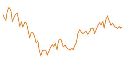
Price charts plot the recent prices of a market on a graph and
provide a snapshot of market movements over a particular period of time.
In this section we examine some of the most common price patterns -:


Each bar or candle on the chart is defined by four price points (high, low, open and close). The length of the bar or candle represents the level of trading activity for a specified period. For example, on a chart with a ten-minute time scale, a bar or candle would represent all of the trading activity of the market in a ten-minute period. When the price of a particular market rises, the bar or candle appears one colour (usually green) and when the price of that market drops, the bar or candle appears another (usually red).

Most traders switch between different time frames so that they can compare market movements and verify trends. For instance most charting software packages allow you to select to view charts with time frames as small as a tick all the way up to one year.
Source :- https://www.contracts-for-difference.com/course/price-charts.html
Line Charts
Line charts are one of three common chart types that most traders use. They provide a quick way to view the changes in price movements over a period of time.
Bar and Candlestick Charts
Bar and candlestick charts provide an easy-to-analyse appearance that displays detailed information about the price movements of a market.
Each bar or candle on the chart is defined by four price points (high, low, open and close). The length of the bar or candle represents the level of trading activity for a specified period. For example, on a chart with a ten-minute time scale, a bar or candle would represent all of the trading activity of the market in a ten-minute period. When the price of a particular market rises, the bar or candle appears one colour (usually green) and when the price of that market drops, the bar or candle appears another (usually red).

Most traders switch between different time frames so that they can compare market movements and verify trends. For instance most charting software packages allow you to select to view charts with time frames as small as a tick all the way up to one year.
Source :- https://www.contracts-for-difference.com/course/price-charts.html
No comments:
Post a Comment